


Goodreads mobile redesign
The process to create design proposals that improve usability of the biggest book recommendation app.
Redesigning the world’s largest mobile app for readers and book recommendations
For this redesign concept exercise, I had the task of redesigning Goodreads’ mobile interface for Android devices, focusing on the search and add friend flows. Generalized feedback from users became the basis of the problem statement.
This project was done during the Encora UX Apprentice Program.
July 2022
Figma
High level goals
The current design has become a usability barrier, which translates in users describing their experience with the app as "helpless."
The app's current interface is outdated. The new design must bring new modern elements but still feel familiar to legacy users.
Goodreads is recognized as the best book recommendations app
Placing first on many online lists, Goodreads has become a brand that users love. Insightful recommendations, seeing what other people are reading and exclusive features like challenges are the main sources of user engagement.
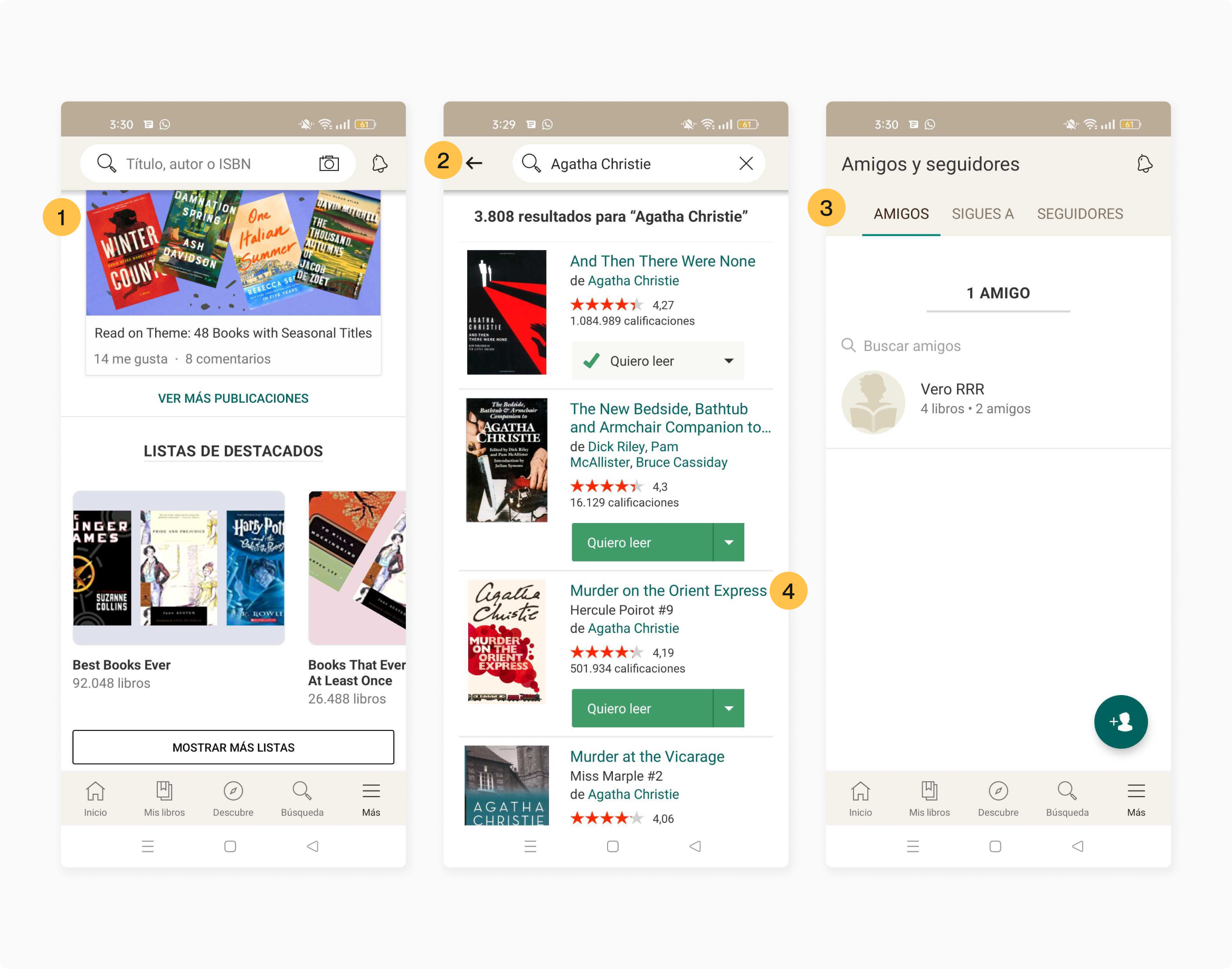
Inconsistency and lack of options are the most common issues on the interface
The analysis of the current interface was focused on the most problematic flows. These findings were pivotal for the design decisions.
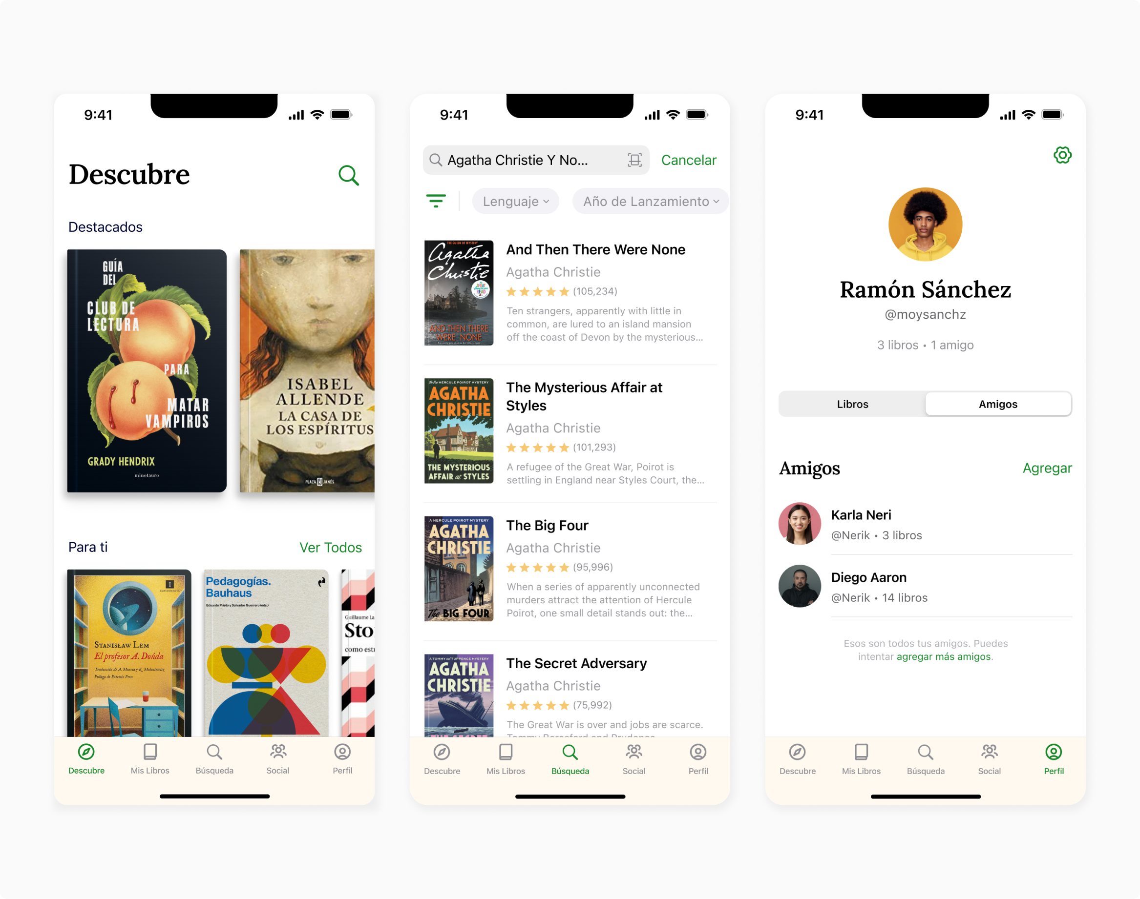
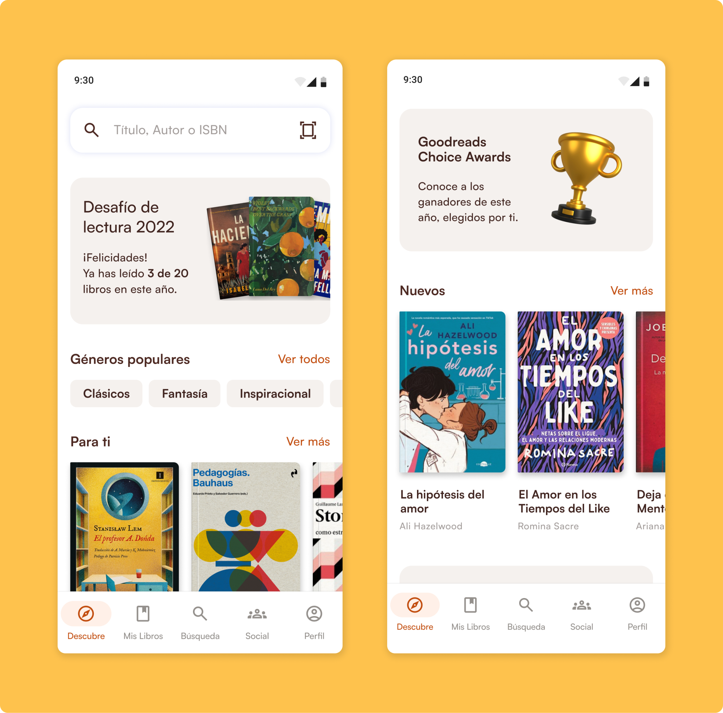
Goodread's key features were not present on the home page.

Engagement
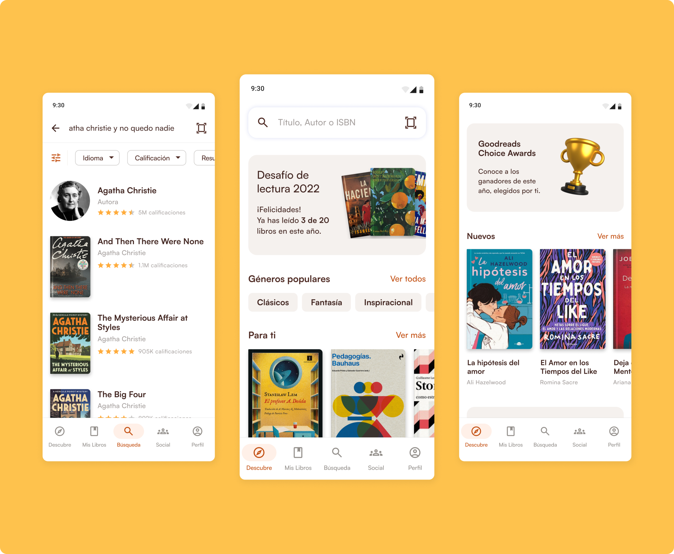
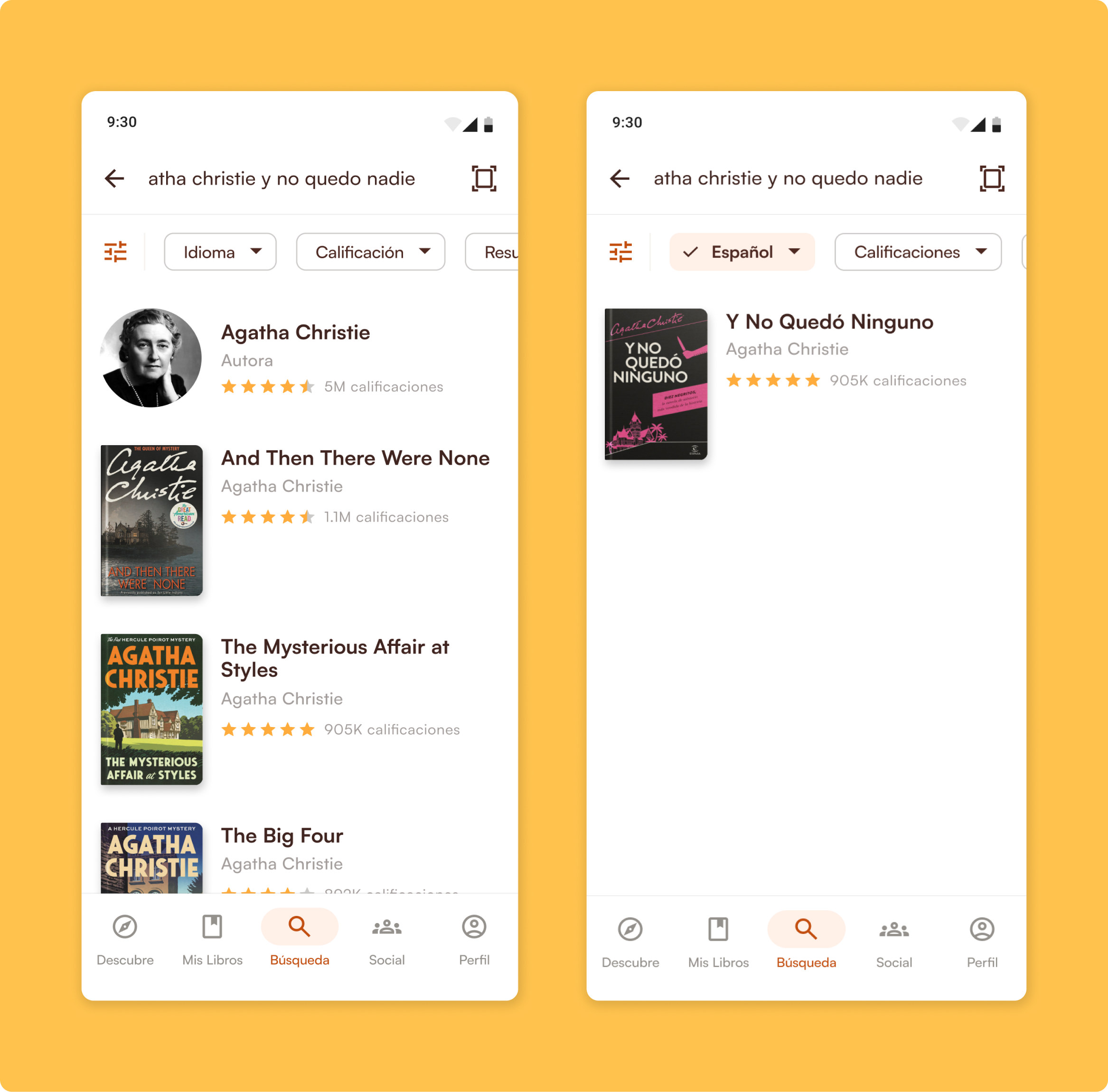
Lack of filtering for search results forces unnecesary effort on the users.

Findability
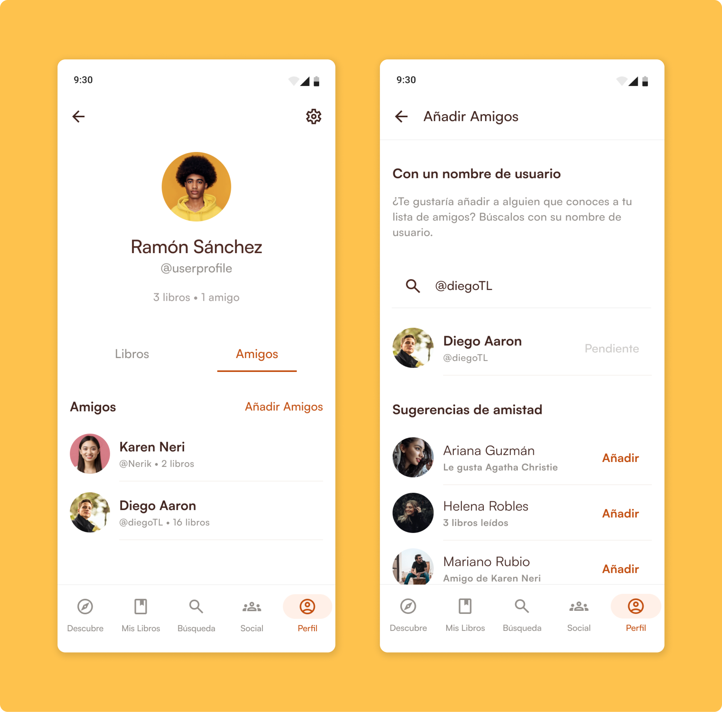
A non-unique username or an email are the only ways of finding a friend.
Usability
Which becomes a barrier for adoption, making non-english speaking users feel alienated.
Language Accessibility
Design for iOS: setbacks after a new visual direction
This new design got mixed results, mostly talking about how Goodreads felt unrecognizable. By testing my designs early, I was able to trace my steps back without compromising the project.
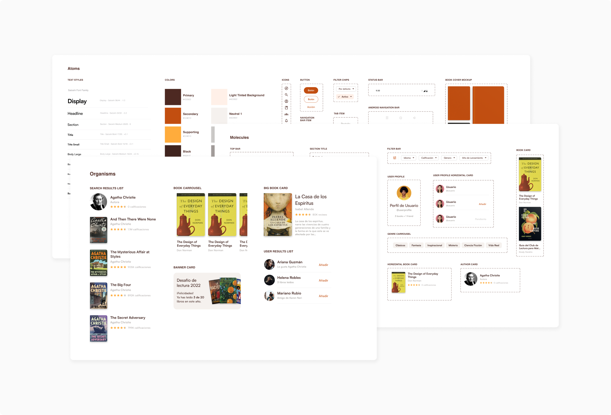
The creation of a scalable design system
A warm palette was chosen to reflect the vintage and intelectual nature of Goodread’s brand identity.
Contrast between text and background was checked to help users with visual impairments read content without issues.
An scalable component set was created in Figma and used throughout the design to facilitate collaboration.
Crafting an intuitive and engaging in-brand experience
Fresh look with a familiar style
In order to make the Goodreads app more appealing to newer generations, while keeping the brand identity recognizable.
Engagement
Filter exactly what you’re looking for
Taking unnecesary effort off the users when searching so they can focus on what really matters: books.
Findability
Lenguage Accessibility
Find your friends without effort
In order to make the Goodreads app more appealing to newer generations, while keeping the brand identity recognizable.
Usability
That’s super great, can I try it?
Yes, you can! Explore the prototype features or take a look at the Figma file.
What did I learn?
Familiarity is really important to maintain long time users.
Following their respective guidelines not only ensures that our app is compliant with industry standards, but also creates a seamless product adoption experience.